


Spend Too Much Time Making Charts?
Frustrated with Six Sigma Project Documentation?
QI Macros 可以幫助您節省時間,而不是讓您花更多時間思考該怎麼操作。QI Macros可以繪製柏拉圖圖表、控制圖、直方圖、箱型圖和散點圖…等等。且利用四個Wizards,讓您釐清什麼樣的圖表適合繪製您的數據資料。
QI Macros可以在Excel中執行,無須移動或複製數據資料到其他應用程式中。只需選擇您的數據,並從QI Macros選單中選擇圖表或Wizard即可。適用於PC(Windows XP,Vista,7,8和10),Macintosh(OSX)和Excel XL2007-2016。
Six Sigma Tools Made Easy
Are you having trouble:
- Drawing Pareto Charts in Excel?
- Choosing and Using Control Charts to analyze performance?
- Figuring out how to draw histograms to analyze the capability of your processes?
QI Macros Creates Six Sigma Tools in Three Easy Steps
Statistical Software for Excel
Struggling with Statistics?
Don't Know Which Test to Run or How to Interpret the Results?
- Does the thought of performing complicated statistical analysis intimidate you?
- Have you struggled with the awkward interface of Excel's Data Analysis Toolpak?
- Tried to learn another more complicated statistics program?
QI Macros Statistical Software Makes Stats as Easy as 1-2-3

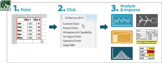
- Point - Use your cursor to select your data in Excel.
- Click - on the QI Macros menu and select the test you want to run. If you are not sure which test, click on our Stat Wizard.
- Analyze and Improve - QI Macros will prompt you for the significance level (default is .05) and run the statistics test for you. QI Macros will even tell you whether you should accept or reject the null hypothesis and why.

QI Macros Statistical Software for Excel includes these statistical tests and tools:
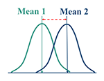
Tests of Means (ANOVA / t tests / z test)
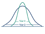
Tests of Variances (f-Test / Levene's Test)
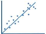
Tests of Relationships (Chi-square / Descriptive Statistics / Multiple Regression Analysis)
And More... (AQL Sampling Tables / Normality Test / Sample Size Calculator)
Lean Six Sigma Tools and Templates
Affordable and Easy Lean Six Sigma Tools for Excel
Does it seem too hard to create all of the documentation for your Lean Six Sigma Project?
- Drawing flowcharts, value stream maps and Ishikawa diagrams?
- Updating monthly charts and dashboards?
- Advanced analysis like Gage R&R, DOE, and so on?
QI Macros Lean Six Sigma Tools for Excel simplify all of these tasks. QI Macros contains more than 30 Six Sigma and SPC Charts and more than 100 fill in the blank templates and tools for all your Lean Six Sigma needs.
Lean Six Sigma Tools and Templates on the QI Macros Menu
QI Macros installs a new menu on your Excel toolbar. Control Chart, Capability Analysis and Statistical templates are organized with their corresponding macros. The Lean Six Sigma templates and tools are located together and organized by major category.
QI Macros Lean Six Sigma Tools Menu in Excel 2007, 2010, 2013, and 2016

QI Macros Lean Six Sigma Tools Menu in Excel 2003 for PC; and Excel 2011 and 2016 for Mac

To open a template, just click on the menu and then click on the tool you want. An Excel worksheet will open. To use templates like the Calculators, DOE, Gage R&R etc. just type or paste data into the yellow shaded input areas.
For Diagrams and Lean Tools like the Value Stream Map, use Excel's drawing toolbar to update the template and to insert boxes, arrows and other symbols.
QI Macros Chart and Statistical Wizards
Built-in Rules So You Don't Have to Memorize Them
-
Confused About Which Chart or Statistic to Choose and Use?
-
Not Sure How to Organize or Summarize Thousands of Rows of Data.
-
You Are Not Alone!
Most Six Sigma Training is designed to turn people into mathematicians or statisticians!
Unfortunately, most people are terrified of math and statistics. To reach a much wider audience, I've found that the QI Macros have to help people over the hurdle of charting and statistical analysis. I've also found that people learn what charts to choose a lot more quickly when the QI Macros helps them draw some charts. The same is true of statistics.
That's Why We Created The QI Macros Wizards
They are easy to spot on the QI Macros Menu:

QI Macros Wizards
Will analyze your data and choose the right charts for you. It saves you time and mistake proofs the chart selection process. Spend your time on more important things like analyzing the charts after they are drawn.
Will analyze your data and choose the right control chart for you: c, np, p, u, XmR, XbarR or XbarS.
Will take up to four columns of tabular data and summarize them using Excel's PivotTable function. I have found that almost everyone is baffled by how to use PivotTables, but all of my multimillion dollar improvement projects have sprung from PivotTable Analysis.
Will analyze your data, create a pivot table of the data, and generate an XmR chart and defect Paretos.
Will analyze your data and choose the right hypothesis tests for you. Hypothesis testing can seem pretty complex and challenging, but it basically wants to know if the means and variances of two or more samples are the same or different. The Stat Wizard will figure it out and tell you in no uncertain terms. No more p values to evaluate.
National Taiwan University Hospital Hsin-Chu Branch Center for Quality Management
Ping-Tung Christian Hospital Administration Department